
Language: Python 3.5
Packages: pandas, numpy, scipy
Methods: mutual information, metric distances, multidimensional scaling
Code repository: https://git.io/vFHF7/
The ‘Brexit’ phenomenon came as a rather unexpected event. However it was the direct result of a combination of demographic, psychological and political characteristics. The present analysis compared data derived from both UK citizens and other European countries. The overarching purpose was to assess how citizens in other countries compare to that certain part of the UK population which voted for their country to leave the EU .
Data acquisition
Query data was supplied by the Dalia Research Group (www.daliaresearch.com) in the form of an Excel spreadsheet. There were a total of 11284 participants drawn from 28 countries. They had to answer a total of 88 questions.
Feature data were categorical (both nominal and ordinal) with the exception of ‘Age’ which was continuous. There were both demographic type questions (education level, religion etc) as well as questions which addressed their political inclinations, views on gender and current state of their home town. The spreadsheet was read into a Pandas dataframe for further processing. A couple of sample questions are provided below.
Do you live in the country you’re currently in?
Possible answers:
1 Yes, as a citizen
2 Yes, but not as a citizen
3 No, I’m a temporary visitor
4 Other
How routine are the tasks you perform at work? If you do
not work currently, think about your last job.
Possible answers:
1 Very routine
2 Somewhat routine
3 Not very routine
4 Not at all routine
5 I’ve never worked
Data preparation
There were 11284 participants drawn from 28 countries averaging 403 participants per country-sample. Answers were provided in text format so they had to be converted into numerical codes. Following this the ‘age’ feature was also converted into a categorical feature by breaking it up into 5 distinct age groups: ‘<18’, ’18-35’, ’35-51’ and ’51-78’ (78 being the maximum age reported in the entire dataset).
Certain questions had to be excluded from the final data set. These were typically questions specific to the participant’s country of origin (e.g. “which party did you vote for in the last election?” etc) meaning that the set of possible answers would be different from country to country. For the sake of parsimony, I decided to remove such questions and were not included as features in the dataset. This left me with a total of 11284 participants x 42 features.
Since the analysis did not involve any classification algorithms which have their own assumptions regarding the nature of the data, there were no transformations imposed on the features.
The United Kingdom dataset, comprised of 1441 participants. I split these into two groups, Brexit voters and non-Brexit voters. Non-Brexit voters comprised of a set of participants who voter either for their country to remain in the EU or did not vote for any outcome. There were 413 (29%) total votes for Brexit, 562 (39%) for Remain and 466 (32%) who did not vote either way. It’s important to note that these proportions are in disagreement with the official referendum results which took place in June, 2016. This highlights the shortcomings of small sample data and also the unpredictability of individual voter preferences.
Data analysis
Analysis consisted of 3 distinct stages each addressing a separate question.
- Which questions are the most relevant in deciding whether a participant would vote for their country to leave the EU?
- Given the voter profile of the Brexit voters, can we establish a measure of how prevalent this voter base is for each individual country?
- How do countries compare with each other in terms of their overall voter profiles?
1.1 Feature information
For this section I ask, which questions included in the questionnaire are the most informative about whether an individual voted for Brexit or not? And I’m using ‘informative’ here in a quite literal sense. Specifically, how much information do we gain by knowing the answer to a particular question. And thanks to information theory we can get a solid, quantitative answer to this query.
Another way to frame this question would be how much reduction in entropy regarding the value of a certain variable do we attain by knowing the value of another variable. In this case the mutual information of voting outcome, X relative to question, Y. First we need to formalise a few probabilistic properties of the dataset.

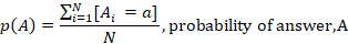

We can now articulate the information content of each question in more concrete terms within the context of the analysis using the following equation:

Where:

I performed this for all 42 questions in my dataset and then ranked them by information content.
1.2 Feature independence
Now that we have an idea about the information content what about the distribution of possible answers for each question? Are there statistically significant differences in the proportions of possible answers between those voted for Brexit and those who didn’t? To address this, I performed a statistical test known as the χ2 test of independence. This is a particularly attractive statistic because it makes no demands for the data to be normally distributed and is ideally suited for counts and proportions. I performed the test on each individual question for both sets (i.e. Brexit voters vs. no Brexit voters). I then ranked them according to their χ2 test – high values indicate high degree of independence and separability.
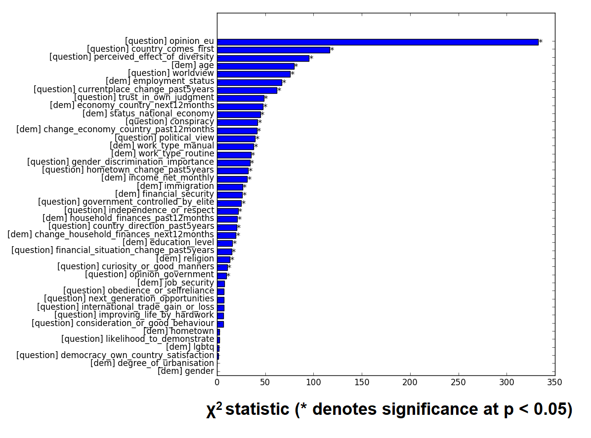
What both the information content and the χ2 test reveal is that there are certain features which are the most distinguishing between people who voted for Brexit and people who didn’t. Namely voter opinion on the EU, perspective on hometown’s progress, priority of country’s interests and perceived effect of diversity seem to stand out. Let’s look at each one of these individually.
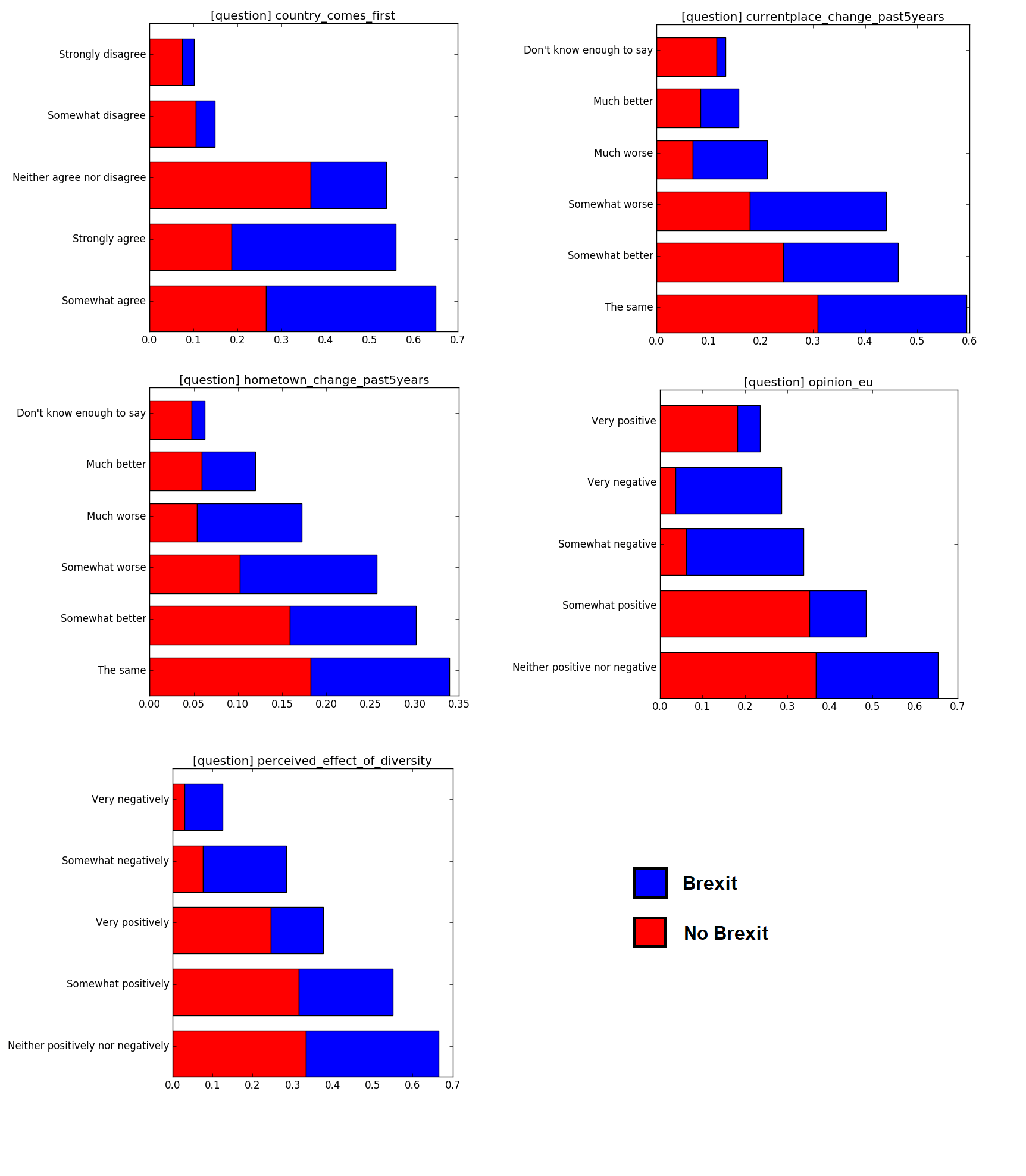 Each answer is ranked from most to least informative, top-to-bottom. The colors denote the proportions of Brexit voters (blue) to non-Brexit voters (red). Notice that due to the nature of how information content is computed, answers with low frequency (i.e. short bars on the bar charts below) tend to have high information. Especially if they skewed towards one category. In this case an answer is only given very rarely and they tend to come from a particular type of voter. This means that in the instance in which it does occur it becomes very predictive of the voter’s outcome.
From these plots we can glean that Brexit voters tend to view their situation, both personal and public, in rather dire terms. Interestingly enough, non-Brexit voters are for the most part more reserved in their opinions but do not seem to swing to more extreme views. In other words, Brexit voters are more likely to perceive something as ‘much worse’ or ‘very negatively’ whereas non-Brexit voters are more lukewarm in their responses. Brexit voters also largely chose ‘retired’ for the employment status whereas ‘student’ was highly prevalent for non-Brexit voters.
Another interesting distinguishing feature was ‘worldview’. Participants were asked “Which of the following statements do you agree with the most?” and had to choose between “Our lives are threatened by terrorists, criminals, and immigrants and our priority should be to protect ourselves” and “It’s a big, beautiful world, mostly full of good people, and we must find a way to embrace each other and not allow ourselves to become isolated”. The results are summarised in the following bar plot.
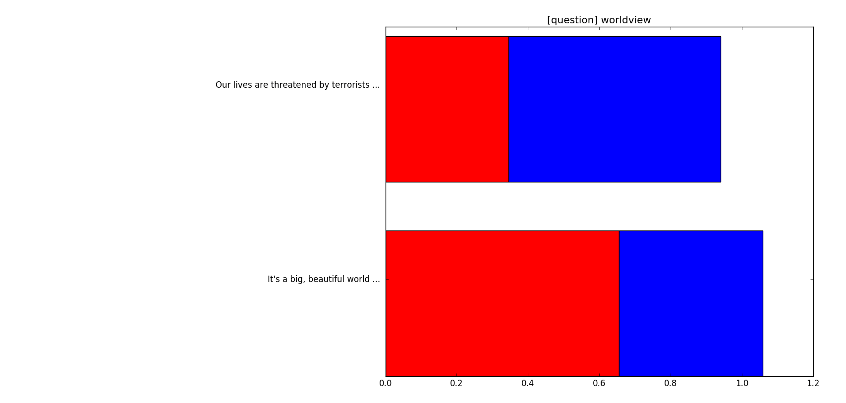
What’s interesting here is that there is a significantly different proportion of answers when both groups are compared. Brexit voters tend to see the world in a more bleak and cynical way compared to the rest. This might be suggestive of a distinct ideological trait common in this group but it’s hard to make any concrete judgements just from this.
2. Prevalence of ‘Brexit-type’ voters
Now that we have a decent idea of what might constitute a typical Brexit voter we can move on to the next question: how does this voter profile compare to other countries? We know valuable probabilistic properties of answers across our reference sample (United Kingdom). Most importantly we have the conditional probabilities of an answer given a specific vote outcome (Brexit / No Brexit). The latter is particularly interesting because it allows us to directly compare these values to relative frequencies found in samples drawn from other countries. But how do we compare these two sets of probabilities? One way is to use a distance metric approach.
A distance metric function takes two vectors as input and computes a value describing some relationship between the two. Metrics generally have to conform to three basic properties, triangle equality (D(A,C)2 = D(A,B)2 + D(B,C)2), non-negativity (D(A,B) ≥ 0) and symmetry (D(A,B) = D(B,A). Some are sensitive to scale (e.g. Euclidean), some are not (e.g. cosine). For the purposes of this analysis I used the Bhattacharyya distance which is especially suited for computing distances between probability distributions. In my case, the possible answers and their associated probabilities constitute a discrete probability distribution. The distance is generally calculated as:
What we want is to compute the distance between the distribution of answers for a given question for a given country (p(Ac)) and the conditional probability distribution of the answers given a specific voter outcome (p(A|V)). What I want to know from this is how close are these two distributions. If for example I compare a country’s answers with the Brexit dataset, high similarity / low distance would suggest that this particular country has a similar answer profile with that particular section of the British public who voted for Brexit.
I performed this metric for each question individually and then summed across questions to get a final value for a given country:
This was done both for Brexit and no Brexit. In the end of this process I ended up with two distance values for each country – one denoting the distance between country responses and Brexit conditional probabilities and the other for no Brexit conditional probabilities. The smaller the value the higher the similarity.
The next step was to combine these two distance values into a measure which quantifies the similarity of a country’s response profile to Brexit in relation to the response profile for no-Brexit:

This ratio I designated as the prevalence. Values above 1 mean that overall the voting profile of participants from that specific country is more similar to Brexit-like responses.
However, this measure is of course a dimensionless number and it’s difficult to interpret whether a country’s prevalence score is actually significant in a statistical sense. In an effort to gain a hold on this, I generated a null distribution out of 1500 randomly generated samples. Each sample represents a random “country” and the resulting prevalence score forms our null distribution. This distribution is approximately Gaussian which allows to us first to compute a z-score for each actual country’s prevalence score as well as p-value thresholds to determine significance –  . These thresholds are computed as the inverse of the cumulative distribution function for 0.95 and 0.99.
![]()
The figure above shows the ranked prevalence z-scores for each country. Dotted yellow and red lines denote the resulting threshold for p < 0.05 and p < 0.01 respectively.
3. Country comparison
So now after we have a handle on the overall profile of each country, the remaining question to address is how do all these countries relate to each other? To determine this I simply computed the Bhattacharyya distance as shown before between the answer probabilities for each possible pair of countries. Then I used metric multidimensional scaling to depict these inter-country relationships on a two-dimensional plot. The size of each point is proportional to the prevalence score calculated earlier.
In addition I’ve applied hierarchical clustering to the data using the pre-computed distance matrix for all countries. Colors denote cluster membership at a cut-off of 1.15 using complete linkage. Dendrogram is shown below.

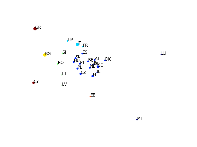
There is a distinct central cluster comprised of mostly mainland EU countries, most of which are in the North-West part of the continent. It’s also interesting to see that both Greece and Cyprus, who share strong cultural ties, are clustered together. Romania, Latvia, Slovenia and Romania comprise another cluster. Generally, it appears that geographical proximity, socio-economic status and cultural ties might play some role in the between-country similarities of people’s answers.
One might wonder what do these dimensions actually mean? Does the position on a particular point signify something interesting about a country’s overall answer profile? One way to address this is to take all values along a specific dimension and then correlate them with the corresponding probabilistic values of specific answer. For example each country has a frequency for the question-answer pair, employment status: unemployed. I can take these frequencies and correlate them against a particular dimension. And then I can do this for every possible question-answer pair in the dataset. I used Spearman’s correlation in this case since it only looks at the rank of values in each vector and has less assumptions regarding linearity and the distribution of the data. To visualise the results of this process I plotted each question-answer pair on a two-dimensional plot with their corresponding correlation values as coordinates. The size of the text denotes the sum of the squares of the correlation values (or the variance) for each dimension.

Countries of the upper, left side of the MDS plot have a large proportion of people perceiving the state national economy as being very poor, having a general mistrust of the goverment with progressively worsening personal finances. Greece, Bulgaria and Cyprus are the countries which fall into this particular corner which are ranked 1st, 2nd and 5th in terms of Brexit-voter type prevalence.
On other side of the spectrum on the lower, right side of the MDS plot, popular perception is quite different. People generally have a positive (or very positive) perception of the country’s direction and financial condition and incomes are generally higher (4800 – 6400 Euros). Countries falling into this bracket are Malta and Luxemburg which are ranked 20th and 22nd in prevalence.
However these countries are rather atypical of the general sentiment in continental Europe. Western and North-Western countries are generally clustered together in the middle with similar response profiles. There does seem to be some geographical correlation but it’s not clear what the underlying causes might be. It is interesting to note however that the three countries on the periphery of the MDS plot, Cyprus, Malta and Luxemburg – which have distinct profiles compared to continental Europe – are small nations, two of which are not even on the mainland.
Concluding remarks
- The top 3 countries with the highest prevalence of Brexit-like voters seem to be Greece, Bulgaria and Italy. This is a reflection of the participants’ poor perception of the country’s direction, mistrust in leadership and overall dissatisfaction with both their personal and financial situation. Their opinion of the EU is as expected largely negative.
- On the other end of the spectrum, Malta and Luxemburg seem to the most content with their country’s direction and show an overall high satisfaction with their finances. Their positive perception of the EU is also reflected in their low prevalence score.
- Rather unsurprisingly the most important factors in determining whether a country might or might not vote to leave the EU are how they perceive the union itself, their socioeconomic state and how much they trust their government having their own best interests in mind. Interestingly, their worldview might also play a role.
